Matplotlib
Contents
Matplotlib#
What is matplotlib?#
Matplotlib is a plotting library for Python
Claim: “make the easy things easy and the hard things possible”.
Capable of:
Interactive and non-interactive plotting
Producing publication-quality figures
Can be used for schematic diagrams
Closely integrated with numpy
Use
numpyfunctions for reading datamatplotlibcan plot numpy arrays easilySee
What does it do?#
People often want to have a quick look at data
And perhaps manipulate it
Large amount of functionality:
Line charts, bar charts, scatter plots, error bars, etc..
Heatmaps, contours, surfaces
Geographical and map-based plotting
Can be used
Via a standalone script (automatiion of plotting tasks)
Via ipython shell
Within a note book
All methods allow you to save your work
Basic concepts#

Everything is assembled by Python commands
Create a figure with an axes area (this is the plotting area)
Can create one or more plots in a figure
Only one plot (or axes) is active at a given time
Use
show()to display the plot
matplotlib.pyplot contains the high-level functions we need to do all the above and more
Basic plotting#
Import numpy (alias np) and matplotlib’s plotting functionality via the pyplot interface (alias plt)
import numpy as np
import matplotlib.pyplot as plt
# If using a notebook, plots can be forced to appear in the browser
# by adding the "inline" option

%matplotlib inline
import numpy as np
import matplotlib.pyplot as plt
# Create some data points for y = cos(x) using numpy

# defining x-array
xmin = 0
xmax = 10
npts = 50
x = np.linspace(xmin, xmax, npts)

# defining y-array, based on x-array
y = np.cos(x)
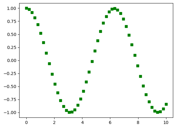
plt.plot(x, y, 'gs') # 'gs': green square
plt.show()

Saving images to file#
Use, e.g.,
pyplot.savefig()File format is determined from the filename extension you supply
Commonly supports:
.png,.jpg,.pdf,.psOther options to control, e.g., resolution
plt.plot(x, y, 'gs')
plt.savefig("cos_gs_plot.png")
# Save image to file in different formats & options
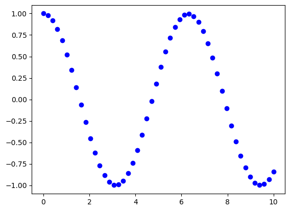
plt.plot(x, y, 'bo')
plt.savefig("cos_plot_bc.pdf")
plt.savefig("cos_plot.png", dpi=300)
plt.show()
Note#
matplotlib is a very large package, an has a great many objects and methods (functions). This can be confusing.
Make sure you are looking at documentation for matplotlib.pyplot
https://matplotlib.org/stable/api/pyplot_summary.html
Can help to use fully qualified names:
import matplotlib
import matplotlib.pyplot

...
matplotlib.pyplot.plot(x, y, 'rv')
to make sure you are getting the right methods.
Plot data from a file#
Step 0#
Download two associated data files random1.dat and random2.dat from our GitHub repo.
!wget https://raw.githubusercontent.com/ARCTraining/swd5_sc_py/main/book/2_matplotlib/random1.dat
!wget https://raw.githubusercontent.com/ARCTraining/swd5_sc_py/main/book/2_matplotlib/random2.dat
--2023-04-27 08:19:12--  https://raw.githubusercontent.com/ARCTraining/swd5_sc_py/main/book/2_matplotlib/random1.dat
Resolving raw.githubusercontent.com (raw.githubusercontent.com)... 185.199.111.133, 185.199.108.133, 185.199.109.133, ...
Connecting to raw.githubusercontent.com (raw.githubusercontent.com)|185.199.111.133|:443... connected.
HTTP request sent, awaiting response... 200 OK
Length: 3300 (3.2K) [text/plain]
Saving to: ‘random1.dat.1’


random1.dat.1         0%[                    ]       0  --.-KB/s
random1.dat.1       100%[===================>]   3.22K  --.-KB/s    in 0s

2023-04-27 08:19:12 (72.9 MB/s) - ‘random1.dat.1’ saved [3300/3300]
--2023-04-27 08:19:12--  https://raw.githubusercontent.com/ARCTraining/swd5_sc_py/main/book/2_matplotlib/random2.dat
Resolving raw.githubusercontent.com (raw.githubusercontent.com)... 185.199.111.133, 185.199.110.133, 185.199.109.133, ...
Connecting to raw.githubusercontent.com (raw.githubusercontent.com)|185.199.111.133|:443... connected.
HTTP request sent, awaiting response... 200 OK
Length: 3300 (3.2K) [text/plain]
Saving to: ‘random2.dat.1’


random2.dat.1         0%[                    ]       0  --.-KB/s
random2.dat.1       100%[===================>]   3.22K  --.-KB/s    in 0s

2023-04-27 08:19:12 (70.1 MB/s) - ‘random2.dat.1’ saved [3300/3300]
Step 1#
Read in the data from the files using numpy.genfromtxt(). You should have two arrays, e.g., data1 and data2. The files contain pairs of values which we will interpret as x and y coordinates. Check what these data look like (that is, check the attributes of the resulting numpy arrays).
data1 = np.genfromtxt("random1.dat")
data2 = np.genfromtxt("random2.dat")
print (data1.shape)
print (data2.shape)
(150, 2)
(150, 2)
Step 2#
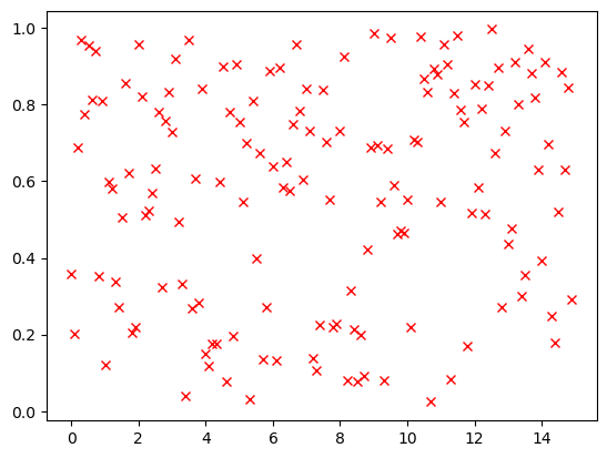
Plot data1 using matplotlib to appear as red crosses (check the online documentation for pyplot.plot). You will need x-coordinates data1[:,0] and the corresponding y-coordinates
plt.plot(data1[:,0], data1[:,1], "rx")
plt.show()
Step 3#
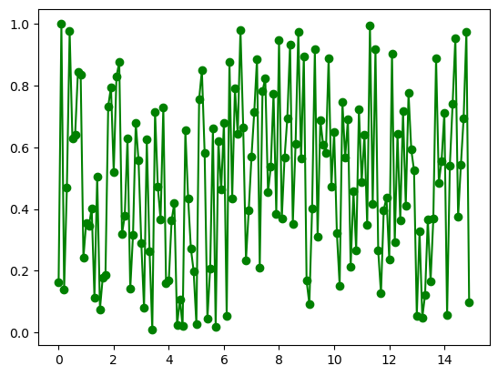
Now plot data2 to appear a green circles connected by a line.
plt.plot(data2[:,0], data2[:,1], "go-")
plt.show()
Step 4#
How do we show
data1anddata2on the same plot?Can you find out how to add labels to the axes?
Can you add a legend?
Hint: you need something like plot(x, y, '+', label = "text") for the legend
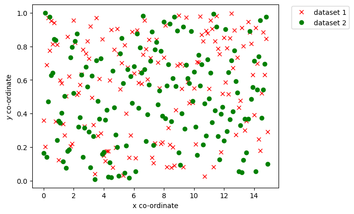
plt.plot(data1[:,0], data1[:,1], 'rx', label = "dataset 1")
plt.plot(data2[:,0], data2[:,1], 'go', label = "dataset 2")
plt.xlabel("x co-ordinate")
plt.ylabel(r"$y$ co-ordinate") # add the r'text' transform the text into LaTeX text. It is useful for math.
plt.legend(loc = "upper right", bbox_to_anchor=(1.3, 1.01))
plt.show()
Customisation#
There are many ways to customise a plot. These may involve interaction with other matplotlib objects.
Figure size#
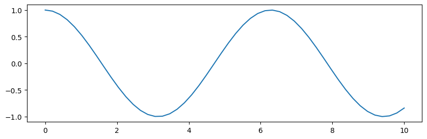
# Set the figure size and add a plot
# The figure size (in inches) can be specified
fig = plt.figure(figsize=(10,3))
plt.plot(x, y)
plt.show()
Lines#
linestyle |
description |
|---|---|
‘-’ or ‘solid’ |
solid line |
‘–’ or ‘dashed’ |
dashed line |
‘-.’ or ‘dashdot’ |
dash-dotted line |
‘:’ or ‘dotted’ |
dotted line |
‘none’, ‘None’, ‘ ‘, or ‘’ |
draw nothing |
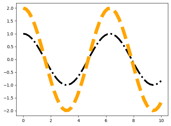
# The linewidth, and linestyle can be changed.
# Note that for standard colours, you can define with the linestyle
plt.plot(x, y, 'k-.', linewidth=4.0)

# you can specify the color name uder "color=" or "c="
# you can use "lw=" instead "linewidth="
plt.plot(x, y*2, '--', c="orange", lw=8.0)
plt.show()
Markers#
See markers for full description of possible arguments.
Define a marker and change sizes
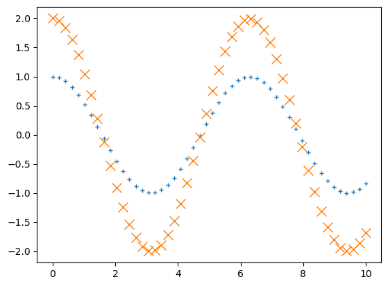
# Markers and their properties can be controlled.
# Unfilled markers: '.',+','x','1' to '4','|'
plt.plot(x,y, '+', markersize=5)
plt.plot(x,2*y, 'x', ms=10)
plt.show()
For a filled marker, change face colour, edge colour, edge width, and size.
# Filled markers include: 'o', 's','*','d','>','^','v', 'p', 'h'
plt.plot(x, y, "D", markerfacecolor = 'g', markeredgecolor = 'r',markersize=8, markeredgewidth=2)

# you can use short for most attributes
plt.plot(x, y*2, "H", mfc = 'y', mec = 'b',ms=10, mew=5)
plt.show()
Combine marker and lines
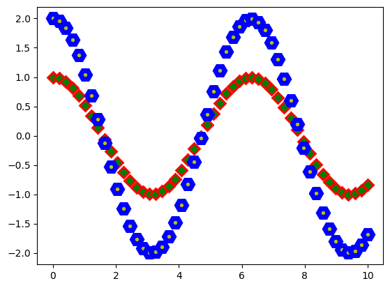
plt.plot(x, y*2, "o-r", mfc = 'y', mec = 'b',ms=5, mew=1)
plt.plot(x, y*3, ":", lw=4, c="g", marker="H", mfc = 'y', mec = 'b',ms=8, mew=1)
plt.show()
Axes and labels#
Set x-axis and y-axis limits.
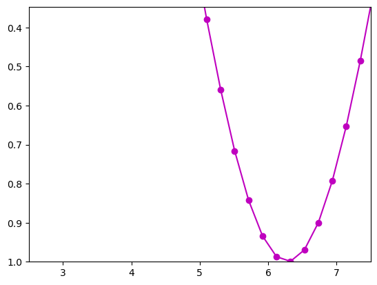
# Set axis limits
plt.plot(x, y, 'mo-')
plt.xlim((xmax*0.25, xmax*0.75))
plt.ylim((np.cos(xmin*0.25), np.cos(xmax*0.75)))
plt.show()
Adjust title.
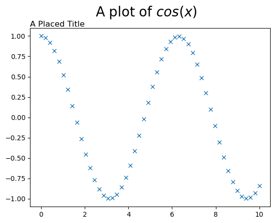
# Set title placement and font properties
plt.plot(x, y, 'x')

plt.suptitle('A plot of $cos(x)$', fontsize = 20)

# Location of the title can be controled via "loc": center, left, right
#"verticalalignment": center, top, bottom, baseline
plt.title('A Placed Title', loc = 'left', verticalalignment = 'top')


plt.show()
Tickmarks#
Add custom tickmarks.
# Tick marks: take the default, or set explicitly
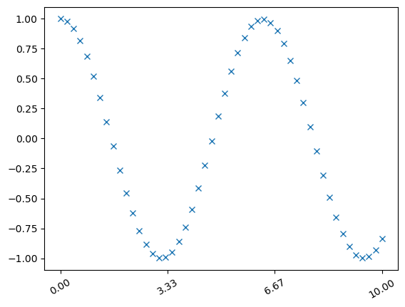
plt.plot(x, y, 'x')
# define new position for the ticks
nticks = 4
tickpos = np.linspace(xmin, xmax, nticks)
# rotate the ticks (degrees)
plt.xticks(tickpos, rotation=30)
plt.show()
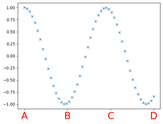
plt.plot(x, y, 'x')

# set arbitrary values
labels = ['A', 'B', 'C', 'D']

# choose a different colour/size
plt.xticks(tickpos, labels, c="red", fontsize=24)
([<matplotlib.axis.XTick at 0x7f4624f2a490>,
  <matplotlib.axis.XTick at 0x7f4624f2af40>,
  <matplotlib.axis.XTick at 0x7f4624ea51c0>,
  <matplotlib.axis.XTick at 0x7f4624ff07f0>],
 [Text(0.0, 0, 'A'),
  Text(3.3333333333333335, 0, 'B'),
  Text(6.666666666666667, 0, 'C'),
  Text(10.0, 0, 'D')])
Annotations#
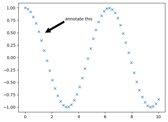
# Arrows and annotations
plt.plot(x, y, 'x')
atext = 'annotate this'
arrowtip = (1.5, 0.5)
textloc=(3, 0.75)
plt.annotate(atext, xy=arrowtip, xytext=textloc,
            arrowprops=dict(facecolor='black', shrink=0.01),)
plt.show()
Subplots#

There can be multiple plots, or subplots, within a figure
Use
subplot()to place plots on a regular grid
subplot(nrows, ncols,
        plot_number)
Need to control which subplot is used
“Current” axes is last created
Or use
pyplot.sca(ax)
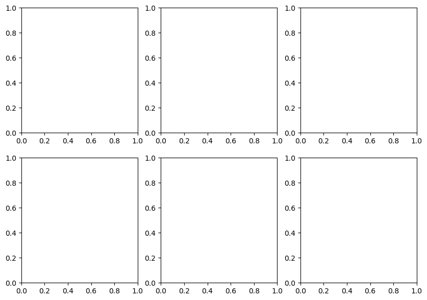
Create subplots
(fig, axes) = plt.subplots(nrows = 2, ncols = 3, figsize=(10,7))

plt.show()
Axes object#
Can move between subplots by keeping a reference to the axes array
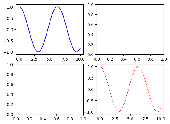
(fig, axes) = plt.subplots(nrows = 2, ncols = 2)

axes[0,0].plot(x, y, 'b-')
axes[1,1].plot(x, y, 'r:')
plt.show()
Configure spaces for better visualisation.
# Space between subplots may be adjusted.
# subplots_adjust(left=None, bottom=None, right=None, top=None, wspace=None, hspace=None)
(fig, axes) = plt.subplots(nrows = 2, ncols = 2)
plt.subplots_adjust(wspace = 0.5, hspace = 2.0)


axes[0,1].plot(x, y, 'b-')
axes[1,0].plot(x, y, 'r-')
plt.show()
General subplots using subplot2grid#

For more control over subplot layout, use
subplot2grid()
subplot2grid(shape,
             location,
             rowspan = 1,
             colspan = 1)
Subplots can span more than one row or column
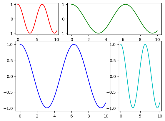
# For example: subplot2grid(shape, loc, rowspan=1, colspan=1)
fig = plt.figure()

ax1 = plt.subplot2grid((3, 3), (0, 0))
ax2 = plt.subplot2grid((3, 3), (0, 1), colspan=2)
ax3 = plt.subplot2grid((3, 3), (1, 0), colspan=2, rowspan=2)
ax4 = plt.subplot2grid((3, 3), (1, 2), rowspan=2)

ax1.plot(x, y, 'r-')
ax2.plot(x, y, 'g-')
ax3.plot(x, y, 'b-')
ax4.plot(x, y, 'c-')
plt.show()
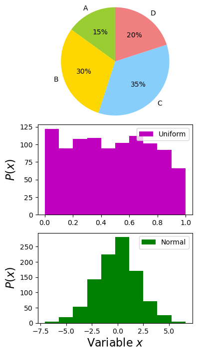
Example: Three plots#
We are now going to try to create a plot, using subplots(), which looks like:

Step 1: Data#
You will need three sets of data.
For the pie chart you will need to create arrays with the four percentages.
The two histograms are generated from data in the files
uniform.datandnormal.datrespectively.
#Pie data
pie_labels = ['A', 'B', 'C', 'D']
pie_sizes = [15, 30, 35, 20]

#Histogram 1 data
!wget https://raw.githubusercontent.com/ARCTraining/swd5_sc_py/main/book/2_matplotlib/uniform.dat
data1 = np.genfromtxt('uniform.dat')

#Histogram 2 data
!wget https://raw.githubusercontent.com/ARCTraining/swd5_sc_py/main/book/2_matplotlib/normal.dat
data2 = np.genfromtxt('normal.dat')
--2023-04-27 08:19:15--  https://raw.githubusercontent.com/ARCTraining/swd5_sc_py/main/book/2_matplotlib/uniform.dat
Resolving raw.githubusercontent.com (raw.githubusercontent.com)... 185.199.108.133, 185.199.111.133, 185.199.110.133, ...
Connecting to raw.githubusercontent.com (raw.githubusercontent.com)|185.199.108.133|:443... connected.
HTTP request sent, awaiting response... 200 OK
Length: 15000 (15K) [text/plain]
Saving to: ‘uniform.dat.1’


uniform.dat.1         0%[                    ]       0  --.-KB/s
uniform.dat.1       100%[===================>]  14.65K  --.-KB/s    in 0s

2023-04-27 08:19:15 (49.2 MB/s) - ‘uniform.dat.1’ saved [15000/15000]
--2023-04-27 08:19:16--  https://raw.githubusercontent.com/ARCTraining/swd5_sc_py/main/book/2_matplotlib/normal.dat
Resolving raw.githubusercontent.com (raw.githubusercontent.com)... 185.199.108.133, 185.199.109.133, 185.199.110.133, ...
Connecting to raw.githubusercontent.com (raw.githubusercontent.com)|185.199.108.133|:443... connected.
HTTP request sent, awaiting response... 200 OK
Length: 15000 (15K) [text/plain]
Saving to: ‘normal.dat.1’


normal.dat.1          0%[                    ]       0  --.-KB/s
normal.dat.1        100%[===================>]  14.65K  --.-KB/s    in 0s

2023-04-27 08:19:16 (49.0 MB/s) - ‘normal.dat.1’ saved [15000/15000]
Step 2: Plotting frame#
You will need to create three subplots, the total size of which can be controlled by the setting the size of the figure object via
fig.set_size_inches(width, height)
Make sure the pie chart appears in the first subplot.
fig, axes = plt.subplots(3,1)
fig.set_size_inches(4.0, 8.0)
Step 3: Plotting & Customisation#
Check the online documentation for the pie chart to see how to produce it
http://matplotlib.org/api/pyplot_api.html#matplotlib.pyplot.pie
And check the documentation for the histogram at
http://matplotlib.org/api/pyplot_api.html#matplotlib.pyplot.hist
The pie chart colours are:
['yellowgreen', 'gold', 'lightskyblue', 'lightcoral']
plt.suptitle ("Three plots", fontsize=20)

#Pie chart
pie_colours = ['yellowgreen', 'gold', 'lightskyblue', 'lightcoral']
pie_radius = 1.5
plt.sca(axes[0])
plt.axis('equal')
plt.pie(pie_sizes, labels = pie_labels, colors = pie_colours,
        radius = pie_radius, startangle = 90, autopct = '%1.0f%%')

#Histogram 1
plt.sca(axes[1])
plt.hist(data1, color ='m', label = 'Uniform')
plt.legend()
plt.ylabel('$P(x)$', size =16)


#Histogram 2
plt.sca(axes[2])
plt.hist(data2, color ='g', label = 'Normal')
plt.legend()
plt.ylabel('$P(x)$', size =16)
plt.xlabel('Variable $x$', size=16)

plt.show()
Other type of plots & settings#
Check the gallery#
Cheatsheets & Handouts#
Customisation : matplotlibrc settings#
Particular settings for
matplotlibcan be stored in a file called thematplotlibrcfile
import matplotlib

matplotlib.rc_file("/path/to/my/matplotlibrc")
You would edit the
matplotlibrcfor different journal or presentation styles, for example. You could have a separatematplotlibrcfor each type of style
See https://matplotlib.org/stable/tutorials/introductory/customizing.html
Settings Example
axes.labelsize  : 9.0
xtick.labelsize : 9.0
ytick.labelsize : 9.0
legend.fontsize : 9.0
font.family     : serif
font.serif      : Computer Modern Roman

# Marker size
lines.markersize  : 3

# Use TeX to format all text (Agg, ps, pdf backends)
text.usetex : True
Summary#
Builds on
numpySimple, interactive plotting
Many examples available online
Good enough for publication quality images
Can be customised for different scenarios
Advanced topic : Matplotlib frontend and backend#
Matplotlib consists of two parts, a frontend and a backend:
Frontend : the user facing code i.e the interface
Backend : does all the hard work behind-the-scenes to render the image
There are two types of backend:
User interface, or interactive, backends
Hardcopy, or non-interactive, backends to make image files
e.g. Agg (png), Cairo (svg), PDF (pdf), PS (eps, ps)
Check which backend is being used with
matplotlib.get_backend()
Switch to a different backend (before importing
pyplot) with
matplotlib.use(...)
import matplot.pyplot as plt
...
For more information:
https://matplotlib.org/stable/users/explain/backends.html#backends